
Landing pages are crucial for e-commerce success. They drive sales and capture leads.
Designing effective landing pages can be challenging but highly rewarding. These pages are the first impression potential customers get of your brand. A well-designed landing page can boost conversions and increase sales. It’s all about creating a seamless experience that guides visitors toward a specific action.
This involves using clear calls-to-action, engaging visuals, and persuasive content. In this blog, we will explore essential tips and strategies to design landing pages that convert. Whether you’re new to e-commerce or looking to improve your existing pages, these insights will help you create effective landing pages that drive results. Let’s dive in!
Credit: agentestudio.com
Introduction To Landing Pages
Landing pages are crucial for driving e-commerce sales. They offer a focused experience for visitors. A well-designed landing page can turn visitors into customers. Let’s dive into why landing pages matter and how they impact sales.
Importance For E-commerce
Landing pages provide a direct path to a product. They reduce distractions. This clear focus increases the chances of conversion. For e-commerce, this is vital. A visitor should find what they need quickly. A good landing page ensures this.
Landing pages also help in tracking visitor behavior. You can see how visitors interact with the page. This data helps in improving future pages. It leads to better user experience and more sales. Landing pages are not just about looks. They must function well too.
Impact On Sales
Good landing pages boost sales. They highlight key product features. They address customer pain points. This makes the product more attractive. Clear calls to action guide the visitor. They know exactly what to do next.
Effective landing pages build trust. They often include testimonials and reviews. This social proof can sway undecided visitors. It makes them feel confident in their purchase.
Landing pages also support marketing campaigns. They can be tailored to match the ad that brought the visitor. This consistency improves the user experience. It increases the likelihood of a sale. Well-designed landing pages are essential for e-commerce success.
“`Key Elements Of Effective Landing Pages
When it comes to boosting e-commerce sales, landing pages play a crucial role. They are the first impression potential customers have of your product. But what makes a landing page effective? Let’s dive into the key elements that can transform your landing page into a conversion powerhouse.
Compelling Headlines
Your headline is the first thing visitors notice. It should be clear, concise, and compelling. A strong headline grabs attention and makes the visitor want to learn more. Think of it as your elevator pitch. You have just a few seconds to make an impact. For example, instead of saying “Buy Shoes Here,” you might say “Step Into Comfort with Our Premium Shoes.”
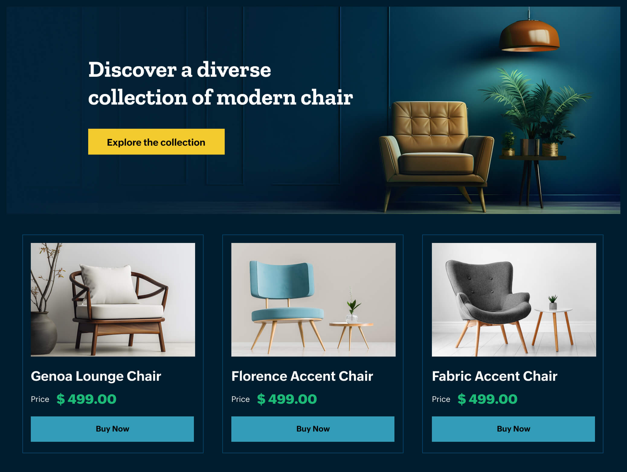
High-quality Images
Images speak louder than words. High-quality images help in building trust and showcasing your product in the best light. They should be clear, well-lit, and show the product from different angles. Consider using a mix of lifestyle images and product-only images. Lifestyle images show the product in use, while product-only images focus on details. This combination helps the customer visualize the product in their own life.
Let’s look at a few tips for using images effectively:
- Use High-Resolution Images: Blurry or pixelated images can turn customers away.
- Show Different Angles: Let customers see all sides of the product.
- Include Contextual Images: Show the product in use to help customers imagine it in their own lives.
Remember, a picture is worth a thousand words. Make sure your images do the talking.
In conclusion, by focusing on compelling headlines and high-quality images, you can create landing pages that not only attract visitors but also convert them into customers. Keep it simple, clear, and visually appealing. After all, the goal is to make your product irresistible!
Crafting A Clear Call To Action
Creating a clear call to action (CTA) is crucial for e-commerce landing pages. A well-designed CTA guides users toward the next step. It can drive conversions and boost sales. This section will explore effective placement tips and the importance of action-oriented language.
Placement Tips
Place the CTA above the fold. Users should see it without scrolling. This increases the chance of engagement. Ensure the CTA stands out. Use contrasting colors. Make it larger than other elements. Position it near relevant content. For example, place it next to product details. This makes it easy for users to take action.
Action-oriented Language
Use clear, concise language. Avoid complex words. Simple phrases work best. Start with strong verbs. Examples include “Buy Now,” “Sign Up,” or “Get Started.” These prompt immediate action. Keep the message direct. Users should know exactly what will happen. Avoid vague terms. Specific CTAs lead to better results.
Credit: www.webibazaar.com
Design And Layout Best Practices
Design and layout play a vital role in creating effective landing pages for e-commerce sales. A well-designed landing page can attract visitors and convert them into customers. Focus on simplicity, clarity, and user experience to ensure success. Let’s dive into some of the best practices for designing and laying out your landing pages.
Mobile-friendly Design
Ensure your landing page looks great on mobile devices. More people shop online using their phones. Use responsive design techniques. This will help your page adjust to different screen sizes. Test your page on various devices. Make sure all elements are easy to navigate on a small screen. Avoid large images that slow down loading times. Quick load times improve user experience and increase sales.
Use Of White Space
White space, or negative space, is crucial in web design. It makes your landing page look clean and organized. It helps direct the user’s attention to important elements. Crowded pages can overwhelm visitors and drive them away. Use white space to separate sections and highlight key information. This makes your page easier to read and navigate. Keep your design simple and uncluttered. This improves the overall user experience and boosts conversions.
Optimizing For User Experience
Optimizing for user experience is crucial in designing effective landing pages for e-commerce sales. A well-designed landing page helps to convert visitors into buyers. Enhancing user experience ensures visitors have a smooth journey from arrival to purchase.
Fast Loading Times
Fast loading times are essential for a successful landing page. Users expect a page to load quickly. Slow pages frustrate users and increase bounce rates. Keep image sizes small without losing quality. Use browser caching to enhance speed. Compress files to reduce load times.
Easy Navigation
Easy navigation keeps users engaged and reduces frustration. Use clear menus and visible buttons. Ensure the layout is intuitive. Include a search bar for quick access. Use breadcrumbs to help users trace their steps. Make sure all important pages are one click away.
Trust Signals And Social Proof
Trust signals and social proof play a crucial role in designing effective e-commerce landing pages. They help build credibility and reduce customer hesitation. People feel more confident buying from a site they trust. This confidence can lead to higher conversion rates.
Customer Reviews
Customer reviews are powerful trust signals. They provide real-life feedback from other buyers. Display reviews prominently on your landing page. Positive reviews can influence potential customers. Show a mix of ratings for authenticity. Avoid displaying only five-star reviews.
Include customer photos when possible. Visual proof adds an extra layer of trust. Ensure reviews are easy to read. Use simple formatting and clear fonts. Highlight key points using bold text. This makes it easy for visitors to scan.
Trust Badges
Trust badges are symbols that show your site is secure. They include SSL certificates, payment security logos, and third-party endorsements. Place these badges near your call-to-action buttons. This reassures customers their data is safe. Common badges include Norton, McAfee, and PayPal.
Use well-known and recognizable badges. Unknown badges might not have the same effect. Ensure the badges are up-to-date. Outdated badges can harm trust. Keep the design clean and clutter-free. Too many badges can overwhelm visitors.
By leveraging customer reviews and trust badges, you can enhance the credibility of your e-commerce landing page. These trust signals are vital for converting visitors into buyers.
A/b Testing And Analytics
Designing effective landing pages for e-commerce sales can feel like navigating a maze. You want to lead your visitors straight to the purchase without losing them along the way. That’s where A/B testing and analytics come into play. By testing different elements and analyzing the results, you can find the perfect combination that converts visitors into customers.
Testing Different Elements
When it comes to A/B testing, you can experiment with a variety of elements on your landing page. Think of it like a science experiment, where you change one variable at a time to see what works best. Here are some key elements you might want to test:
- Headlines: Try different headlines to see which one grabs attention.
- Call-to-Action (CTA) Buttons: Test different colors, sizes, and texts.
- Images: Use different images to see which resonates more with your audience.
- Product Descriptions: Experiment with different lengths and styles.
For instance, you could test two headlines: “Buy Now and Save 20%” vs. “Limited Time Offer: 20% Off”. Which one do you think would perform better? Only one way to find out!
Analyzing Results
Once you’ve run your tests, it’s time to dive into the data. Analyzing the results can be as exciting as unwrapping a gift. You’ll want to look at metrics such as:
- Conversion Rate: The percentage of visitors who complete the desired action.
- Bounce Rate: The percentage of visitors who leave the page without interacting.
- Average Time on Page: How long visitors stay on your page.
Using tools like Google Analytics or dedicated A/B testing software can help you make sense of the numbers. Don’t get bogged down by the data; look for clear winners and patterns. Did the red CTA button outperform the green one? Did visitors spend more time on the page with the video? Use these insights to refine your landing page further.
Remember, the goal is to continuously improve. Even small tweaks can lead to significant gains in your e-commerce sales. And who doesn’t love a good success story?
Seo Strategies For Landing Pages
Designing landing pages for e-commerce sales involves many strategies. One crucial aspect is optimizing these pages for search engines. SEO strategies can significantly increase traffic and conversions. Let’s dive into some key SEO strategies for your landing pages.
Keyword Integration
Keywords are essential for SEO. Research and choose relevant keywords for your products. Integrate these keywords naturally into your content. Include them in your headings and subheadings. This helps search engines understand your page’s topic.
Don’t overstuff keywords. It can harm your SEO ranking. Use variations and related terms. Ensure the content remains readable and engaging for users.
Meta Descriptions
Meta descriptions are short summaries of your page. They appear in search engine results. Write compelling meta descriptions to attract clicks. Include your primary keyword in the meta description.
Keep the meta description under 160 characters. This ensures it displays fully in search results. Make it clear and concise. Highlight the benefits users will get by visiting your page.
Common Mistakes To Avoid
Designing landing pages for e-commerce sales can be tricky. Many elements must come together to create a seamless user experience. Yet, mistakes can easily occur. These mistakes can significantly impact your conversion rates. Let’s explore some common pitfalls to avoid.
Cluttered Design
A cluttered design confuses visitors. Too many elements on a page can overwhelm users. They won’t know where to focus. This leads to a higher bounce rate. Keep your design clean and straightforward. Focus on essential elements. Highlight your products and key information. White space is your friend. It helps guide users’ eyes. It makes the page look more organized.
Also, avoid using too many fonts and colors. Stick to a consistent style. This makes the page look professional. It also helps build trust with your visitors. Remember, less is more. A simple design can be very effective.
Weak Ctas
Your call-to-action (CTA) buttons must stand out. Weak CTAs can hurt your conversion rates. The text on your buttons should be clear and compelling. Use action words like “Buy Now” or “Add to Cart”. These phrases tell users exactly what to do. Avoid vague terms like “Click Here”.
Placement of CTAs is crucial. They should be easy to find. Place them above the fold. This means users don’t have to scroll to see them. Also, use contrasting colors. This makes the buttons pop. A strong CTA can make a big difference in your sales.
Case Studies And Success Stories
When it comes to designing landing pages for e-commerce sales, nothing speaks louder than real-world examples. In this section, we delve into case studies and success stories that highlight how effective landing page design can skyrocket your sales. You’ll find insights on successful e-commerce examples and the lessons learned from them. Let’s dive right in and see what we can learn from these remarkable success stories.
Successful E-commerce Examples
Ever wondered how top e-commerce sites create landing pages that convert? Let’s look at some successful examples:
- Example 1: XYZ Clothing
- Example 2: ABC Electronics
- Example 3: FreshMart
XYZ Clothing focused on clean, minimalistic design with high-quality images. They used a strong call-to-action (CTA) – “Shop Now” – placed prominently. This approach led to a 30% increase in conversion rates within three months.
ABC Electronics incorporated customer testimonials and reviews on their landing page. They also highlighted a limited-time offer, creating a sense of urgency. The result? A 45% boost in sales during the promotional period.
FreshMart, an online grocery store, personalized their landing page based on user behavior. They used data analytics to show products that users were most likely to buy. This personalized experience led to a 50% reduction in bounce rate and a significant increase in repeat customers.
Lessons Learned
What can we learn from these success stories? Here are some key takeaways:
- Simplicity Sells
- Trust is Crucial
- Personalization Pays Off
Keep your design simple and clutter-free. Use high-quality images and a clear, strong CTA. This makes it easy for users to understand what action you want them to take.
Incorporate customer testimonials and reviews. People trust other customers’ experiences more than brand messages. This can greatly influence their decision to purchase.
Use data analytics to personalize the user experience. Show them products they are likely to buy based on their behavior. This can drastically reduce bounce rates and increase sales.
By learning from these case studies, you can apply similar strategies to your own e-commerce landing pages. Remember, the goal is to make your landing page as user-friendly and persuasive as possible.

Credit: www.shutterstock.com
Frequently Asked Questions
How To Design An Ecommerce Landing Page?
To design an effective ecommerce landing page, keep it simple and visually appealing. Highlight key products, use high-quality images, and include clear calls to action. Ensure fast loading times and mobile-friendliness. Optimize for SEO with relevant keywords, meta tags, and user-friendly URLs.
How Do I Create A Landing Page For Selling?
To create a landing page for selling, choose a catchy headline, use high-quality images, write clear benefits, include testimonials, and add a strong call-to-action.
What Is The Structure Of A Landing Page In E Commerce?
A landing page in e-commerce includes a headline, product images, a brief description, key benefits, customer reviews, and a clear call-to-action.
How Much Do Web Designers Charge For A Landing Page?
Web designers typically charge between $300 and $2,500 for a landing page. Prices vary based on complexity and experience.
Conclusion
Crafting effective landing pages boosts your e-commerce sales. Focus on clear, concise messages. Highlight product benefits. Use eye-catching visuals. Ensure easy navigation. A strong call-to-action drives conversions. Test different elements. Improve based on feedback. Simple design attracts customers. Keep user experience in mind.
Engaging landing pages lead to higher sales.