
Designing a user-friendly e-commerce website is crucial for success. It impacts customer satisfaction and sales.
An effective e-commerce site should be easy to navigate and visually appealing. Good design keeps users engaged and encourages them to make purchases. In this guide, we will explore the key elements of a user-friendly e-commerce website. From intuitive navigation to responsive design, we will cover essential tips to enhance user experience.
Whether you are starting from scratch or improving an existing site, these insights will help you create a website that users love. Let’s dive into the world of user-friendly e-commerce design.

Credit: vnextglobal.com
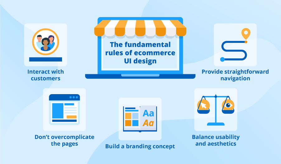
Introduction To User-friendly Design
Creating a user-friendly design is crucial for any e-commerce website. A good design keeps customers engaged and makes shopping easy. People prefer sites that are simple and intuitive. This helps in building trust and encouraging repeat visits.
Importance Of User Experience
User experience (UX) is all about how a person feels when using your site. A smooth and pleasant experience can lead to more sales. Frustration can make users leave and not return. A well-designed site reduces barriers to purchase. It also helps users find what they need quickly.
Goals For E-commerce Websites
The main goal for an e-commerce website is to drive sales. But there are other important goals too. Building trust with customers is key. Offer clear product information and easy navigation. Ensure a fast and secure checkout process.
Another goal is to provide excellent customer support. This includes easy access to help and clear return policies. All these factors contribute to a positive user experience.
Research And Planning
When it comes to designing a user-friendly e-commerce website, research and planning play a crucial role. Think of it as laying the foundation for a house. Without solid groundwork, the structure won’t stand. Similarly, without thorough research and planning, your e-commerce site is unlikely to meet the needs of your users. Let’s dive into some key aspects of this phase.
Understanding Target Audience
Knowing who your customers are is half the battle. Imagine trying to sell winter coats in a tropical climate – it just wouldn’t work. By understanding your target audience, you can tailor your website to suit their preferences and needs. Here are some steps to get started:
- Demographic Research: Identify the age, gender, location, and income level of your potential customers.
- Behavioral Analysis: Understand their online habits – what websites do they visit? What products do they buy?
- Customer Feedback: Gather insights from existing customers through surveys and feedback forms. It’s like getting a roadmap to their hearts.
Analyzing Competitors
Ever heard the saying, “Keep your friends close, but your enemies closer?” Well, in business, your competitors can teach you a lot. Analyzing competitors helps you understand what’s working in your industry and what isn’t. Here’s how you can do it:
- Identify Key Players: List your top competitors. What are they doing right? What can you do better?
- Website Review: Examine their website layout, user experience, and product offerings. Are there any features that stand out?
- SWOT Analysis: Assess their strengths, weaknesses, opportunities, and threats. Use this analysis to carve out your unique selling point (USP).
By understanding your competitors, you can avoid their pitfalls and capitalize on their successes. It’s like having a cheat sheet for your business strategy.
In conclusion, the research and planning phase might seem tedious, but it’s a vital step in creating a user-friendly e-commerce website. With a clear understanding of your audience and a thorough analysis of your competitors, you’ll be well on your way to building a site that not only attracts but also retains customers. Remember, the devil is in the details, so don’t rush this stage. Happy planning!
Choosing The Right Platform
Choosing the right platform is crucial for designing a user-friendly e-commerce website. The platform you select will impact everything. From the design flexibility to the user experience. It will also affect your site’s performance, security, and scalability.
Popular E-commerce Platforms
Many e-commerce platforms are available today. Some of the most popular ones include:
- Shopify: Known for its ease of use and excellent customer support.
- WooCommerce: A WordPress plugin that offers great customization options.
- Magento: Suitable for large businesses with complex needs.
- BigCommerce: Offers robust features and scalability.
Key Features To Consider
When choosing a platform, consider the following features:
- Ease of Use: The platform should be simple to navigate and manage.
- Customization Options: Look for platforms that offer design flexibility.
- Payment Gateways: Ensure it supports multiple payment methods.
- Security: Choose a platform that offers strong security features.
- Scalability: The platform should grow with your business.
These features are essential for providing a smooth user experience. They help in creating a reliable and user-friendly e-commerce website. Remember, the right platform can make all the difference.

Credit: www.allbusiness.com
Creating An Intuitive Navigation
Designing a user-friendly e-commerce website involves many elements, but one of the most crucial is creating an intuitive navigation system. Imagine walking into a store where everything is laid out logically, and you can find what you need in seconds. That’s what you want for your website. An easy-to-navigate site not only enhances the user experience but also boosts sales. Here, we delve into how you can achieve this with Simple Menu Structures and Clear Call-to-Actions.
Simple Menu Structures
When it comes to menu structures, simplicity is key. Think of your website menu as a roadmap for your visitors. If it’s cluttered and confusing, they’ll likely leave. But if it’s clear and straightforward, they’ll stick around and explore.
- Limit the Options: Keep your main menu to a maximum of seven items. More than that, and it becomes overwhelming.
- Use Clear Labels: Use simple, descriptive words for your menu items. For example, “Shop,” “About Us,” and “Contact” are universally understood.
- Group Related Items: If you have a lot of categories, group them into dropdown menus. For example, under “Shop,” you could have “Men,” “Women,” and “Kids.”
Remember, less is more. By keeping your menu structure simple, you make it easier for your visitors to find what they’re looking for, which can lead to more sales.
Clear Call-to-actions
A Call-to-Action (CTA) is like a signpost guiding your visitors on what to do next. Without clear CTAs, your visitors may get lost or leave your site. Here are some tips to create effective CTAs:
- Be Direct: Use action-oriented words like “Buy Now,” “Sign Up,” or “Learn More.”
- Make Them Stand Out: Use contrasting colors and bold fonts to make your CTAs catch the eye.
- Place Them Strategically: Position your CTAs where they are easily visible, such as at the top of the page, at the end of product descriptions, and in the shopping cart.
For example, I once visited a site with a great deal on shoes, but I couldn’t find the “Add to Cart” button. Frustrated, I left. Don’t let that happen to your visitors. Clear CTAs can significantly improve your conversion rates.
In conclusion, creating an intuitive navigation is essential for a user-friendly e-commerce website. By keeping your menu structures simple and your call-to-actions clear, you can create a seamless shopping experience that keeps customers coming back. Try these tips, and watch your website’s usability and sales improve!
Designing For Mobile Users
In today’s digital age, having a user-friendly e-commerce website is crucial for attracting and retaining customers. With the increasing use of smartphones, designing for mobile users has become a top priority. A mobile-friendly site ensures that users can easily navigate and make purchases, no matter what device they’re using. So, how do we create a seamless mobile experience? Let’s dive into some key aspects of designing for mobile users.
Responsive Design Principles
Responsive design is all about creating a website that adapts to different screen sizes and orientations. This ensures that your site looks and functions well on any device, whether it’s a smartphone, tablet, or desktop. Here are some principles to follow:
- Fluid Grids: Use flexible grid layouts that resize content proportionally, rather than using fixed-width layouts.
- Flexible Images: Make sure images scale with the grid, so they don’t break the layout on smaller screens.
- Media Queries: Use CSS media queries to apply different styles based on the device’s screen size and resolution.
Think of your website as a chameleon, adapting to its environment. A responsive design ensures that your customers have a consistent experience, whether they’re browsing on a tiny phone or a large desktop monitor.
Optimizing For Speed
Speed is everything in the online world. Did you know that 40% of users will abandon a website if it takes more than 3 seconds to load? For mobile users, speed is even more critical. Here are some tips to optimize your e-commerce site for speed:
- Compress Images: Large images can slow down your site. Use tools like TinyPNG or JPEG Optimizer to reduce file sizes without sacrificing quality.
- Minify Code: Remove unnecessary characters from HTML, CSS, and JavaScript files. This can significantly reduce file sizes and improve load times.
- Use a Content Delivery Network (CDN): CDNs distribute your content across multiple servers worldwide, reducing load times for users who are far from your main server.
Remember, a fast-loading site can be the difference between making a sale and losing a customer. So, don’t let your site drag its feet!
In conclusion, designing a user-friendly e-commerce website for mobile users involves a blend of responsive design principles and speed optimization techniques. By ensuring your site is adaptable and quick to load, you can provide a seamless shopping experience that keeps customers coming back for more.
Enhancing Visual Appeal
When it comes to designing a user-friendly e-commerce website, enhancing its visual appeal is crucial. Think of your website as the shop window. If it looks attractive, more people will stop by and explore. A visually appealing site keeps visitors engaged and makes browsing enjoyable. Let’s dive into some essential aspects that can significantly enhance the visual appeal of your e-commerce website.
Effective Use Of Colors
Colors can make or break your website. They evoke emotions and set the tone. Imagine walking into a store with walls painted in a dull, lifeless color. Would you feel excited to shop there? Probably not! Here’s how to use colors effectively:
- Choose a Color Palette: Stick to a harmonious color palette that aligns with your brand’s identity. For example, if your brand is eco-friendly, you might want to use greens and browns.
- Contrast for Readability: Ensure there is a good contrast between text and background colors. This makes your content easy to read.
- Use Colors to Highlight: Use colors to draw attention to important elements like ‘Buy Now’ buttons or special offers. A splash of a vibrant color can go a long way.
High-quality Images And Videos
High-quality visuals can turn casual visitors into potential buyers. Imagine browsing an online store with grainy images; it’s not very convincing, is it? Here’s how to use images and videos effectively:
- Use Professional Images: High-resolution images of your products from multiple angles can help customers make informed decisions. Invest in a good camera or hire a professional photographer.
- Incorporate Videos: Videos can showcase your products in action. A short video demonstrating a product’s features can be very persuasive.
- Optimize Image Sizes: Ensure your images are optimized for fast loading. Slow loading times can frustrate users and drive them away.
Enhancing the visual appeal of your e-commerce website is like giving it a charming personality. It’s about creating a welcoming environment that makes visitors feel at home. As you focus on colors and high-quality visuals, remember that these elements should complement each other to create a cohesive and delightful user experience. So, are you ready to give your e-commerce site a visual makeover?
Streamlining The Checkout Process
Designing a user-friendly e-commerce website involves many crucial steps. One of the most important is streamlining the checkout process. A smooth checkout experience reduces cart abandonment. This leads to higher sales and better customer satisfaction. Let’s explore key aspects of this process.
Simplified Forms
Long and complicated forms frustrate customers. Keep forms short and simple. Only ask for necessary information. Use auto-fill options to save time. Group related information together. This makes the form easy to follow. Clearly label each field. Provide clear instructions if needed.
Multiple Payment Options
Customers prefer different payment methods. Offer multiple payment options to cater to all preferences. Include credit and debit cards. Add digital wallets like PayPal, Apple Pay, and Google Pay. Consider offering local payment methods for international customers. Ensure all payment gateways are secure. This builds trust and encourages sales.

Credit: m.facebook.com
Building Trust And Credibility
Building trust and credibility in your e-commerce website is crucial. Customers need to feel safe and confident when shopping online. Trustworthy sites attract more buyers and drive sales. Below are some ways to build trust and credibility.
Displaying Customer Reviews
Customer reviews provide social proof. They show potential buyers that others have had positive experiences. Display these reviews prominently on product pages. Include both positive and negative reviews. This transparency builds trust. Make sure reviews are genuine and verified.
Ensuring Data Security
Data security is a top priority. Customers need assurance that their information is safe. Use HTTPS for secure communication. Display security badges from trusted providers. Regularly update your software to protect against threats. Offer multiple payment methods for added security.
Testing And Optimization
Testing and optimization are crucial steps in designing a user-friendly e-commerce website. These processes help identify areas for improvement. They also ensure the website meets user needs effectively. By regularly testing and optimizing, you can enhance user experience and increase conversions.
A/b Testing Techniques
A/B testing compares two versions of a webpage. This helps determine which one performs better. Create two variations of a single element. For example, a headline or call-to-action button. Show each version to different user groups. Analyze the data to see which version gets better results. Implement the winning version on your site.
Test one element at a time. This will help you understand what changes impact user behavior. Use A/B testing tools like Google Optimize or Optimizely. These tools offer easy setup and accurate results. Continuously test and refine your website elements.
Gathering User Feedback
User feedback provides valuable insights into your website’s performance. It helps identify pain points and areas that need improvement. Use surveys and feedback forms to gather opinions from visitors. Ask specific questions about their experience. For example, how easy it was to navigate or find products.
Consider using live chat support. This allows users to share their thoughts in real-time. Monitor social media platforms and review sites. Users often share honest feedback there. Analyze this feedback to make informed decisions. Implement changes based on user suggestions.
By focusing on testing and optimization, you can create a seamless user experience. This leads to satisfied customers and increased sales.
Future Trends In E-commerce Design
As the digital world continues to evolve, so does the landscape of e-commerce. Staying ahead of the curve is crucial for any e-commerce business aiming to thrive. In this section, we’ll explore some of the future trends in e-commerce design that are set to revolutionize the way we shop online. From artificial intelligence (AI) to voice commerce, these advancements promise to create more personalized and user-friendly experiences for customers.
Ai And Personalization
AI is transforming the e-commerce industry by providing more personalized shopping experiences. Imagine visiting an online store where the products you see are tailored just for you, based on your browsing history, preferences, and even your mood! AI algorithms analyze data and predict what products you might be interested in, making your shopping journey smoother and more enjoyable.
For instance, have you ever noticed how Netflix suggests movies and TV shows that align with your taste? E-commerce platforms are leveraging similar technology. Here’s a table to show some benefits of AI and Personalization:
| Benefit | Description |
|---|---|
| Product Recommendations | Suggests items based on user behavior and preferences |
| Dynamic Pricing | Adjusts prices based on demand, competition, and user interest |
| Chatbots | Provides instant customer support and answers queries in real-time |
Voice Commerce
Voice commerce is another emerging trend that’s gaining traction. With the rise of voice-activated devices like Amazon’s Alexa and Google Assistant, customers are becoming more comfortable with using their voice to make purchases. Voice commerce allows users to shop hands-free, making the process faster and more convenient.
Consider this: you’re cooking dinner and realize you’re out of olive oil. Instead of pausing to type on your phone or computer, you can simply say, “Alexa, order olive oil.” Within seconds, your order is placed. How convenient is that?
- Hands-Free Convenience: Customers can shop without needing to use their hands, perfect for multitasking.
- Speed: Voice commands are quicker than typing, saving precious time.
- Accessibility: Great for people with disabilities or those who find typing difficult.
These trends not only enhance the user experience but also increase sales and customer loyalty. Embracing AI and voice commerce can set your e-commerce business apart from the competition and ensure you stay relevant in an ever-changing market. So, are you ready to step into the future of e-commerce design?
Frequently Asked Questions
How Would You Design A Website For Ecommerce?
Design a user-friendly eCommerce website with clear navigation, fast loading speed, and mobile responsiveness. Use high-quality images, compelling product descriptions, and easy checkout processes. Integrate secure payment gateways and implement SEO strategies for better visibility.
How Can You Make Your Web Design User-friendly?
Make your web design user-friendly by ensuring easy navigation, fast loading times, mobile responsiveness, clear calls-to-action, and accessible content.
What Is The Best Structure For An Ecommerce Website?
The best structure for an eCommerce website includes intuitive navigation, clear categories, search functionality, high-quality images, and secure checkout.
Can I Code My Own Ecommerce Website?
Yes, you can code your own eCommerce website. Use HTML, CSS, and JavaScript for the front-end and a server-side language like PHP or Python for the back-end. Ensure it is secure and user-friendly.
Conclusion
Creating a user-friendly e-commerce website boosts customer satisfaction and sales. Focus on clear navigation and fast loading times. Use high-quality images and easy-to-read fonts. Ensure mobile-friendliness for better reach. Simplify the checkout process to reduce cart abandonment. Provide excellent customer support through live chat or easy contact forms.
Regularly update your site to meet user needs. Testing and feedback help identify areas for improvement. A user-friendly design keeps customers coming back.